Datami · Mobile service · 2018–210 → 1Hands-on2 min read
Reach Mobile: cutting the purchase flow until people finished it
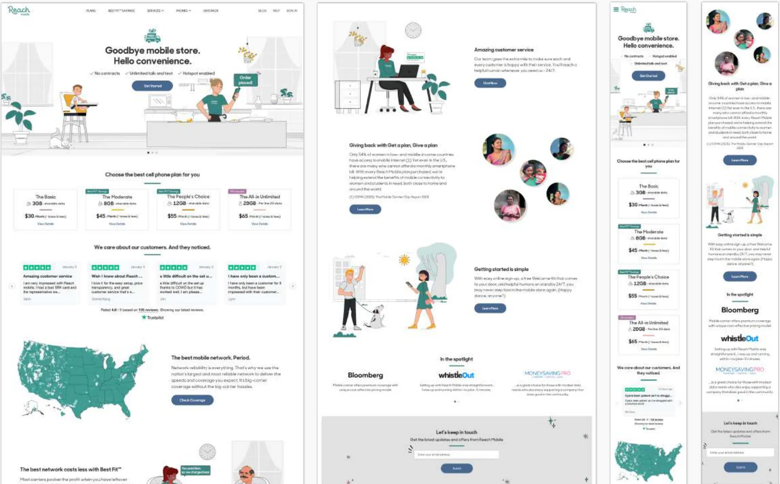
A US SIM service sold and activated entirely online. My manager and I were hired as its first designers. I led the website and mobile web, where 98% of sales happened, and rebuilt the purchase flow around the version people actually finished.
- The problem
- Sell, activate and support a US SIM plan entirely online, for people used to doing all of that in a store.
- My role
- Design Lead for the website and mobile web. With my manager, one of the product’s first two designers.
- The call
- When the long purchase flow kept losing people, replace it with the short campaign flow people were already finishing.
- The result
- The flow people finished became the flow for everyone, on the website and mobile web that carried 98% of sales.
The situation
Reach Mobile was a mobile virtual network operator: it sold SIM cards and plans in the US over another carrier’s network. The idea was a service young people could buy, set up and manage from their phones, without ever visiting a store.
Research run by the marketing team in the US, 15 interviews and two surveys with more than 600 people aged 18 to 34 across all 50 states, showed what that had to fix. People went to a store to buy a SIM, to switch operators and to sort out problems; friends sharing a plan had to find a time to go together; and many felt their unused data was wasted.
The product had to be designed from scratch, cover a lot of features, and ship quickly, with a design team of two.
My role
There were no full-time designers before us. My manager and I were hired to start the product, later joined by a visual designer. I led the experience on the website and mobile web, and designed journeys in the mobile app when needed.
I ran a daily check-in with the design team, walked the 20-person engineering team through each design, reviewed what they built and made sure anything we let slip in one sprint was fixed in the next. Twice a week I reviewed the work with the product manager.
Cutting the purchase flow until it worked
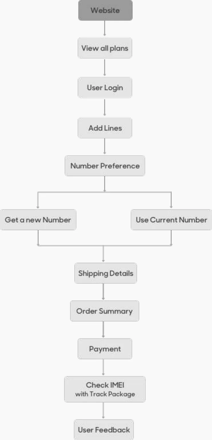
About three months after launch the business moved its network from AT&T to Verizon. At the same time I gathered feedback on the purchase flow through customer support. People kept saying it was too long, and analytics showed many dropping out partway. We shortened it.
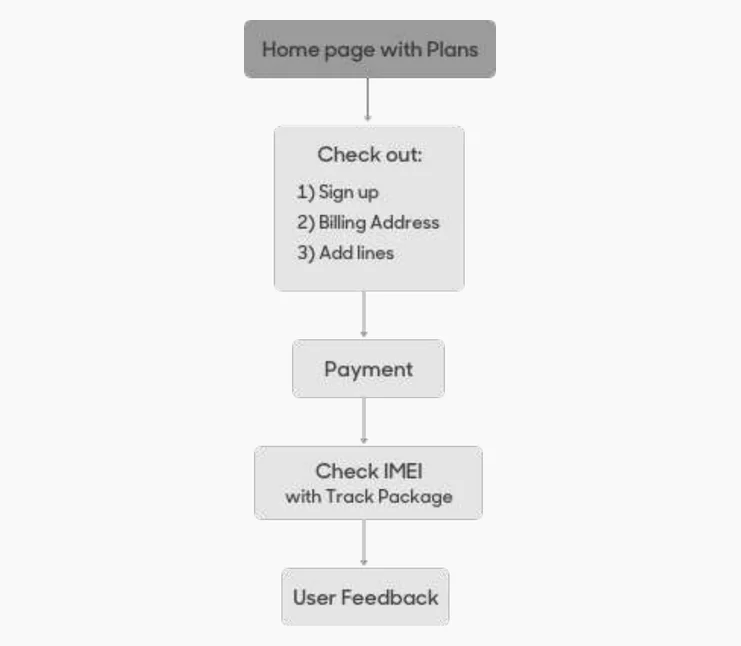
Drop-offs and complaints continued. Meanwhile, a fast purchase flow we had built for people arriving from social media and ads was losing very few of them and drawing no complaints.
We also started asking for feedback right after payment, so we heard from people in the moment rather than through support tickets.
The short flow became the only purchase flow on the website and mobile web.
Outcome
The site kept evolving after launch. I designed app journeys including notifications, troubleshooting, setting a later payment date and updating a card. The business then began turning Reach Mobile into Reach Platform, offering the same service to other companies, and I led the design for that business-to-business side.
What I learned
- Know who is really buying. Soon after launch the audience shifted from people in their twenties to people over 35, and the site had to be redesigned for them.